LZX Banner Design Competition

RobinHood

Clan Admin
FFF Member
Joined
Jun 20, 2010
Messages
4,332
Points
113
Location
London
Real Name
Alex
slide.jpg


Another new Lanzone is coming and so a new Lanzone graphic is required for the LZX forum.

This winning graphic will also be printed out as a huge banner and hung up at the event itself.

This is your chance to get your creative juices flowing and create something very cool!

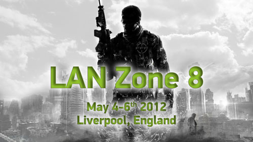
Previous banners have looked like this:
LAN-8-Notice.jpg


ac3y_LZ9_Banner800.jpg


index.php


The final banner will be printed out at 1000mm tall by approx 3000mm, depending on the length of the image made. It's advised you make your original files at 300 dpi (pixels/inch).

The winning one will also be scaled down and the digital version used here in the LZX forum to appear above every thread.

The winner will be picked before the end of March. GL HF!
 
View attachment 1148

Another new Lanzone is coming and so a new Lanzone graphic is required for the LZX forum.

This winning graphic will also be printed out as a huge banner and hung up at the event itself.

This is your chance to get your creative juices flowing and create something very cool!

Previous banners have looked like this:

LAN-8-Notice.jpg


ac3y_LZ9_Banner800.jpg


index.php


The final banner will be printed out at 1000mm tall by approx 3000mm, depending on the length of the image made. It's advised you make your original files at 300 dpi (pixels/inch).

The winning one will also be scaled down and the digital version used here in the LZX forum to appear above every thread.

The winner will be picked before the end of February. GL HF!
 
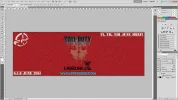
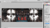
Something I'm working on. :cool: Obviously its not finished yet. :D

index.php


index.php
 

Attachments

  • LZX BANNER SNEEK PREVIEW.png
    LZX BANNER SNEEK PREVIEW.png
    1 MB · Views: 1,039
  • LZX BANNER SNEEK PREVIEW 2.png
    LZX BANNER SNEEK PREVIEW 2.png
    1.9 MB · Views: 1,172
index.php


created in CMYK with your above dimensions.

(this is a screen shot as the original file is about 24MB)

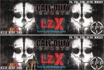
Nice one mate, personally I think it would look better if you scrapped the dog and the man in bottom right, maybe put the FFF logo down there instead, but edit the logo to fit in with the text you have in other corners and remove the perspective on the logo.

Just my 2p as they say.
 
Nice one mate, personally I think it would look better if you scrapped the dog and the man in bottom right, maybe put the FFF logo down there instead, but edit the logo to fit in with the text you have in other corners and remove the perspective on the logo.

Just my 2p as they say.
FFFBANNER2014-VER6.jpg


Something like that supertom44
Suggestions always welcome :D :D :cool:
 
Nice one mate, I prefer the one without the dog, haha I have nothing against dogs I just don't think it blends as well.

My OCD would suggest duplicating the FFF logo to the upper left corner as well but thats just because I like symmetry :p

Also if I'm being really picky which I am (feel free to tell me to shut it haha), the blue web address doesn't really fit the colour scheme of the overall poster.

I will be quiet now, in all seriousness I do like it mate, just being picky. That's the cool thing with stuff like this there are so many different thing you could try, deciding which one looks the best is the hard part.
 
Come on Tom lets see what you have to offer, maybe you could be a winner???......
 
Nice one mate, I prefer the one without the dog, haha I have nothing against dogs I just don't think it blends as well.

My OCD would suggest duplicating the FFF logo to the upper left corner as well but thats just because I like symmetry :p

Also if I'm being really picky which I am (feel free to tell me to shut it haha), the blue web address doesn't really fit the colour scheme of the overall poster.

I will be quiet now, in all seriousness I do like it mate, just being picky. That's the cool thing with stuff like this there are so many different thing you could try, deciding which one looks the best is the hard part.


TBH i prefer it without the dog :P now i've slept on it.

the webby was blue cos it had a red and black pixel background at first. changed it to red now. :D
 
TBH i prefer it without the dog :p now i've slept on it.

the webby was blue cos it had a red and black pixel background at first. changed it to red now. :D

Nice banner.
How about with the wolf? Color would fit better than dog.
 
index.php


created in CMYK with your above dimensions.

(this is a screen shot as the original file is about 24MB)

Looks good dems great effort m8 !! ... i luv this one ... but it dont matter what i think lol ..im just sayin :oops: .. but i do agree with tom on the colour change on the web address ;)
 
Back
Top Bottom